
Postman Brand & UX Redesign
In 2021, Postman underwent a comprehensive visual rebrand, overhauling the framework of its marketing website family. I collaborated closely with the Engineering, Marketing, and Product teams to reimagine the UX and update the site layouts. As a key contributor, I developed robust design guidelines to support a major codebase refactoring and built a versatile Figma component library that is now used company-wide.

Problem
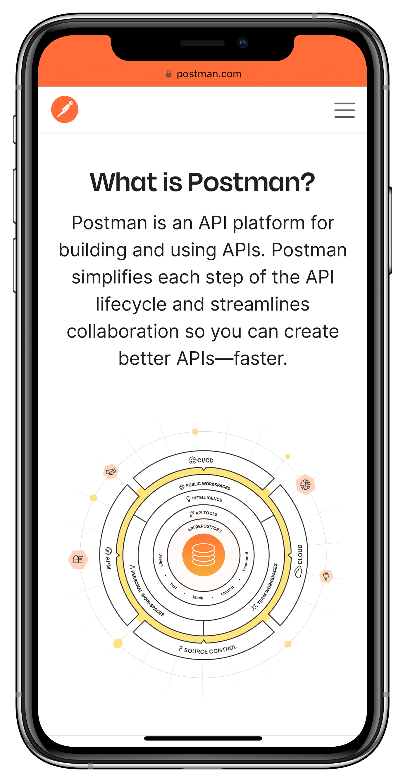
Transform Postman’s digital ecosystem by uniting navigation across our Marketing Website, Learning Center, Blog, and Public API Network, restructuring information architecture, and implementing scalable, reusable design components—enhancing page visibility and establishing a cohesive brand presence that supports future growth.
Goal
Deliver a future-proof design framework that unifies Postman’s digital properties and enables scalable, rapid iteration by developing a versatile component library and robust design guidelines to streamline content mapping. Set a clear roadmap for phased enhancements to prioritize a minimum viable product that elevates the brand and enables ongoing innovation.
Results
Empowered Teams. The new component library enables teams to build their own pages, driving consistency and efficiency.
Unified Branding. Cross-functional collaboration delivered a cohesive digital experience across both the website and in-product environments, reinforcing our brand identity at every touchpoint.
80% Reduction in Redundancy. Streamlined design components cut redundant elements by 80%, boosting operational efficiency.
21% Fewer Website Fail Reports. Consistent, repeatable design patterns and components created a deliberate, seamless experience that significantly reduced reports of website failures.
4+ Years of Consistency. The component library, in use for over four years, has become a cornerstone of our digital experience, enabling rapid iteration and consistency across teams.
50% Faster Iteration & 80% Reduced Build Time. Reusable, scalable approach cut design iteration time by half and reduced development time by up to 80%.
Process and Approach
Collaborative Planning and Strategy
I began the project by working closely with UX researchers to determine the new information architecture. Together, we identified which pages should be prioritized for redesign in the initial phase. This research-driven approach ensured that the redesign addressed user needs while aligning with business goals.
Designing Complex Navigation and Components
I led the creation of a complex yet intuitive navigation system, designed to unify multiple digital properties into a cohesive experience. By assessing cross-team UX design efforts, I distilled various directions into concise, actionable components. This provided a clear framework for the design team and stakeholders to follow.
Component Guidelines and Logic
I established initial guidelines for how different components should interact. This included defining how components stack, the logic behind background color choices based on content emphasis, and ensuring consistent behavior across the site. These guidelines ensured a cohesive experience and improved usability across all touchpoints.
Mapping Existing Content and Refining Typography
I mapped existing content to the new components, carefully refining typography for both desktop and mobile experiences. This work ensured that the typography was responsive, visually appealing, and in line with the new brand guidelines, offering users a seamless experience regardless of device.
Launch and Ongoing Maintenance
After successfully launching the new site, I created and maintained a comprehensive Figma component library, which became a key resource used cross-team throughout the company. This library ensured that all teams were aligned with the design standards and could easily access components for future use.
Phase 2: Refining and Expanding the Redesign
I led the second phase of the redesign, which included:
Capturing and redesigning all secondary pages.
Mapping outdated components to the newly created components.
Conducting a full site review to ensure that every page was updated according to the new design system.
Leading ancillary design updates, including video assets, social assets, badges, newsletters, podcast branding, swag, and sales enablement materials.
Collaboration with Engineering and Marketing
Throughout the entire project, I collaborated closely with the Marketing Engineering team to ensure that the design vision aligned with the technical implementation. This collaboration was crucial during the code refactoring phase, as we deliberately defined user experiences while new components were built and mapped to the existing content.
Ensuring Long-Term Success and Consistency
By ensuring clear design guidelines and fostering collaboration between design, engineering, and marketing, I helped deliver a unified digital experience that would continue to serve the company’s long-term needs. The new component library and design system streamlined future work, maintaining consistency and usability as the brand continued to grow.
Conclusion
This strategic overhaul unified Postman’s digital presence and established a future-proof design framework that has accelerated feature deployments and streamlined both design and build processes, cutting development time by up to 80%. With cross-functional collaboration, I was able to leverage reusable components and robust guidelines to build a cohesive brand experience that continues to drive rapid, sustained innovation. This project underscores the impact of integrating design, engineering, and marketing efforts to achieve long-term business success.
Mapping the Experience: IA & Navigation Explorations

Early complex navigation exploration
These explorations accommodated our growing navigation by logically grouping content and emphasizing intuitive movement between tabs. The approach emphasizes intuitive movement between tabs, preserving clarity and discoverability.
Information Architecture
This site-wide IA blueprint ensured that content was logically grouped and easily discoverable, streamlining user journeys and strengthened brand consistency across all digital touchpoints.
Defining the Foundations: Typography, Color, and Grid Systems

Typography, Color, and Grid Systems
These foundational elements integrated with our existing illustration style to ensure a cohesive visual language, streamlining design iteration across the site ecosystem.
Assembling Modules: Hero Sections, Headers, and Call-Outs

Hero Sections, Headers, and Call-Outs
These foundational elements integrated with our existing illustration style to ensure a cohesive visual language, streamlining design iteration across the site ecosystem.
Enhancing Visual Identity: Badges & Reusable Illustrations
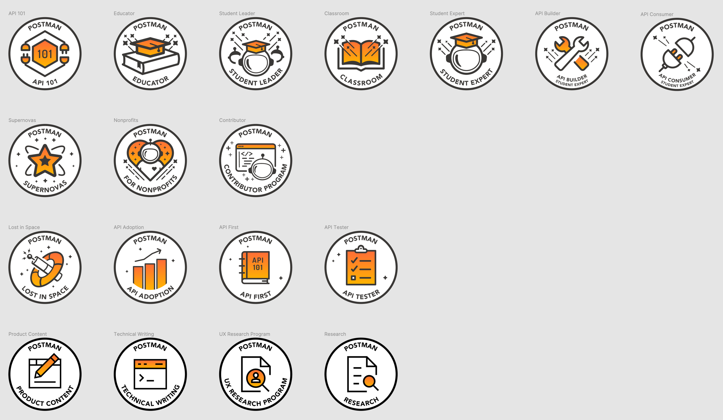
Group and achievement badges
These badges aligned with our refreshed brand identity, creating visual milestones that foster user engagement and reinforce a sense of accomplishment.

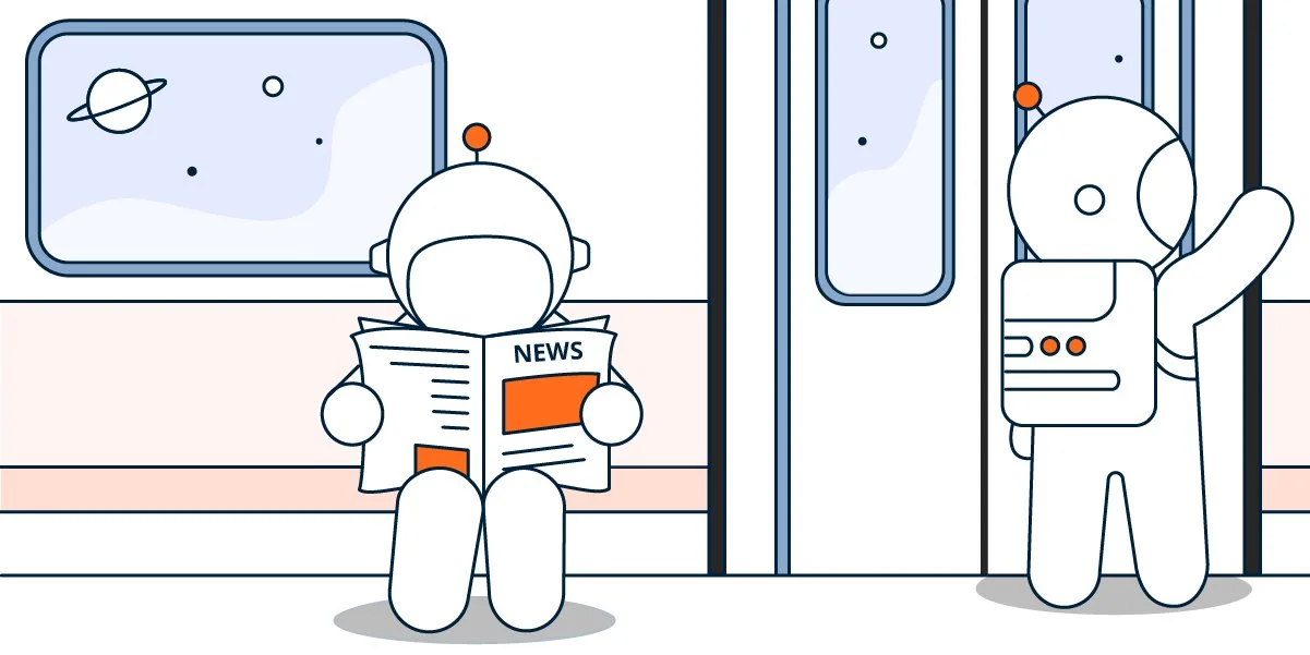
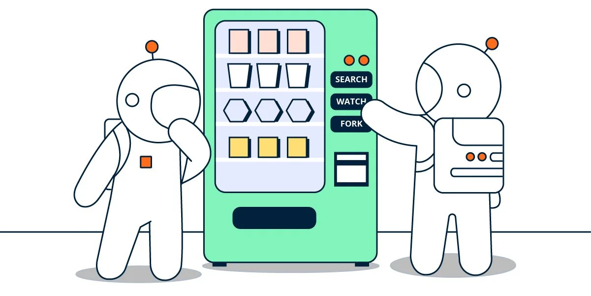

Reusable newsletter images
Consistent, on-brand illustrations provided a scalable way to reinforce the rebrand across marketing channels, streamlining creative efforts and maintaining audience interest.